morePlatz
architecture / urbanism / art / office / publications / contact deutsch
|
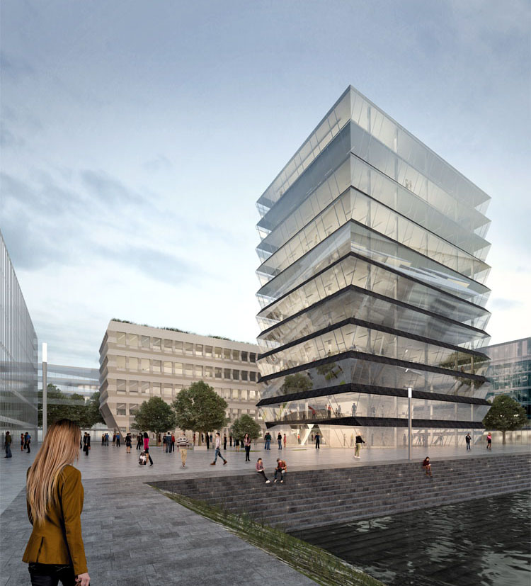
What type of 'Spitze' would the harbour in Mainz deserve?
Like in many cities in Europe and worldwide, former harbour areas are being developed into new neighbourhoods. The mix of old and new and the natural setting are the key ingredients for a typical redevelopment. In order not to repeat too much the same successful story it would be important to add a local flavour to the new buildings as well. In that way a more specific Mainzer Mood could be imagined. In the case of the Hafenspitze is there is no special program or public function known yet that could be used as driving forces for developing the local touch. Maybe that can be a blessing in disguise. It leads to a more neutral and open design as the future users and dwellers of the new buildings are not known yet. We can learn from the success of the re-use of old warehouses, which are relatively neutral but specific elements like old structural elements, windows, or facade materials define the character. Furthermore these buildings are strong volumes and often have a certain harbour silhouette. For our project we use such 'Mainzer elements' in both of the buildings. Combined with current requirements of sustainability and modern working environment they suggest two individual characters in Zollhafen. They form a pair, which is characterised by similarities and differences, and offers at an early stage a point of identification to the harbour district. |
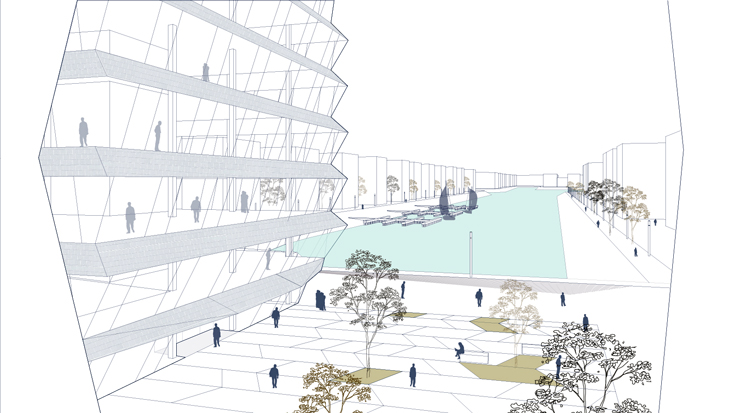
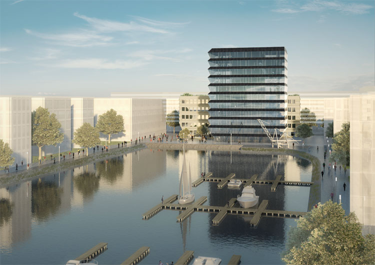
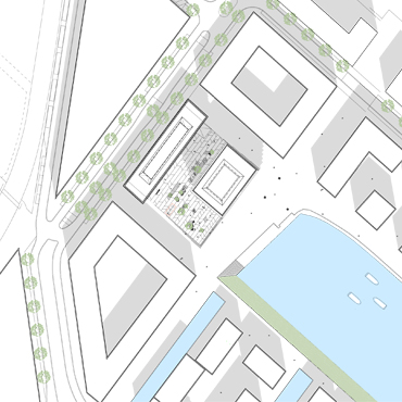
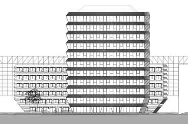
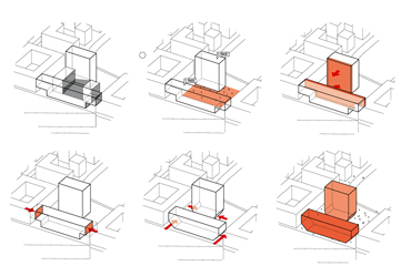
The design for the plot is based on a new interpretation of the urban masterplan - two free-standing volume instead of city-block sliced open. Thus, the court becomes a public plaza, and the new buildings can take advantage of the unique location at the head of the harbor. It can develop a distinctive character for the place, which is an important feature especially for a pioneering development of the area. Moreover, some flaws of the original plan to be corrected. The two buildings, the block and the tower, form an ensemble, expressed by the design of the tapering plinth and by similarities in the facade concept. At the same time the required differences in budget and function are expressed in the outer appearance. The volumes are designed as rather deep and compact office buildings compensating for the omission of the two side wings. |
 |
|
|
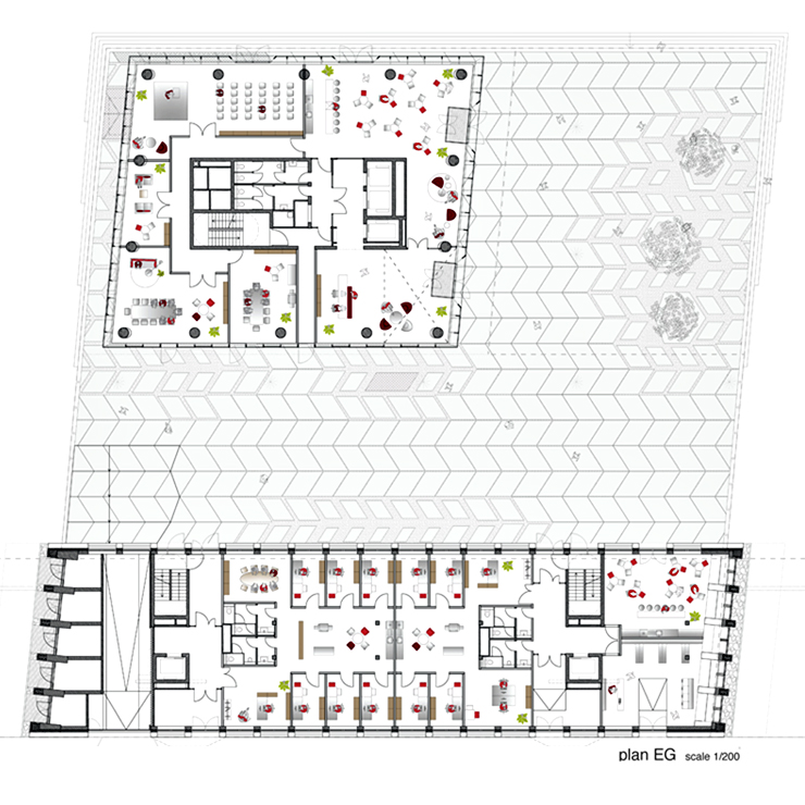
The cut-outs from the plinth zone of the tower open up the plaza and the sight lines towards the harbour. At the lower block, the plinth zone is cantilevering over the road in order to compensate and add more floorspace. The measure of the cantilever is resulting from a functional consideration, namely the maximum flight distances within the building. It could be built with a single core due to these dimensions. In addition, the short facades get daylight due to the distance to the neighbour. |
|
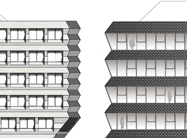
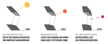
The two buildings are distinguished in materialization, both in exterior appearance and in the interior regarding installations and equipment standards. In the historic center of Mainz one sees two special elements in many of the old buildings - the dark slate covered roofs, and the rough 'Rustikasteine' framing plastered surfaces. The facade concept for the Hafenspitze buildings is referring to these two impressions. The dark bands of the tower facade are covered with slate shingles. The glass bands sloping inwards allow for maximum views of the harbour and the new quarter. The façade elements of the block refer to the roughness of the sandstone bands, which give a strong 3D-profile to facades. The new office block is wrapped in a 'rough skin' of prefab folded elements of bright rough concrete or artificial stone. The openings are cut out of this wrapping. |
 |
|
|
The lower block has one large lobby that extends between the two cores, so that there is one address for all tenants. Due to the target group of start-ups and creative industries loft-like spaces and equipment are proposed. The height of the building is divided into five equal storeys, which should not be reduced by double floors or suspended ceilings. It creates spacious offices or ateliers with a 'rough charm'. The roof is a garden, accessible for tenants. team credits: |
